

THE PROBLEM
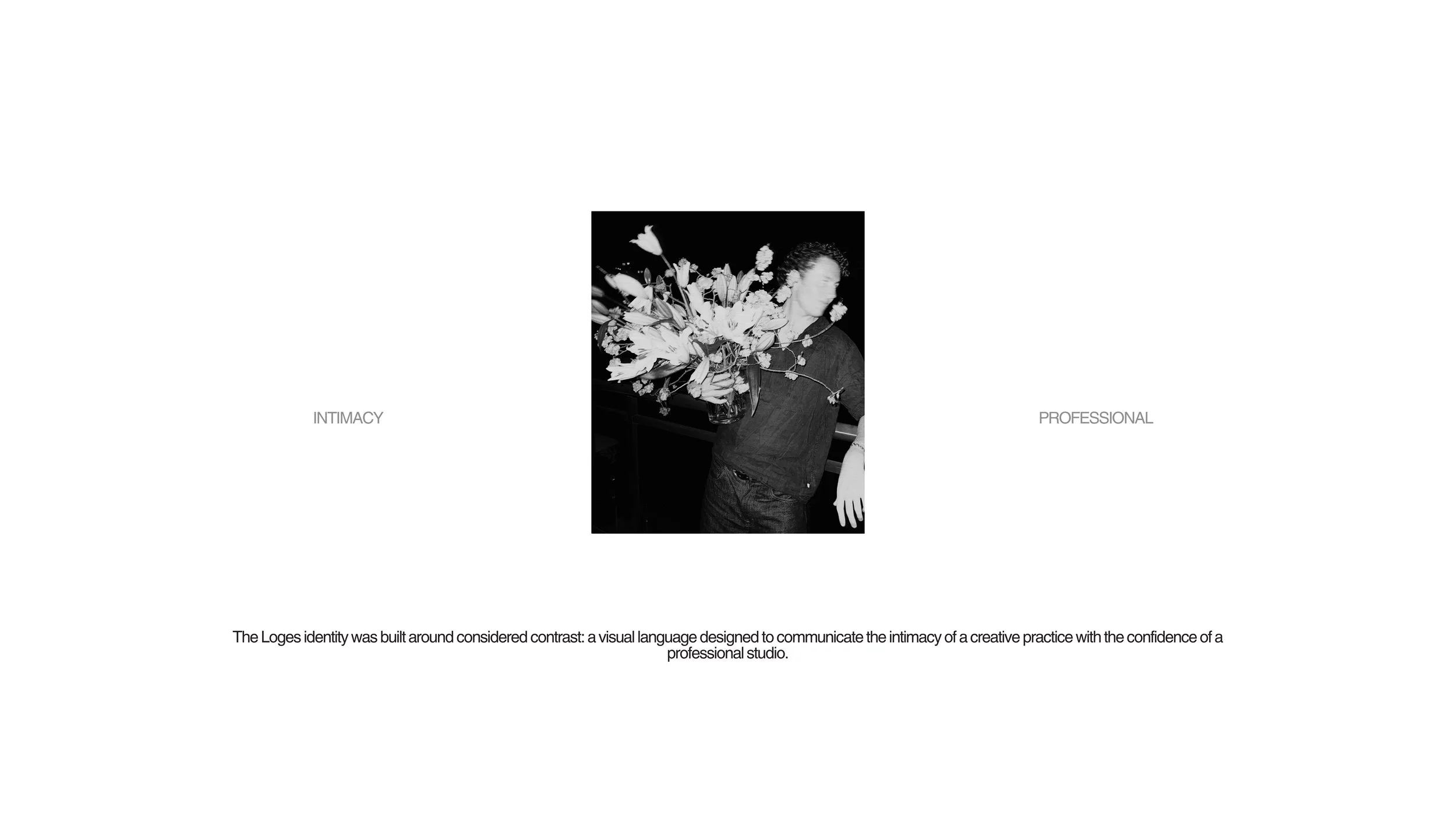
Build a professional identity for a design-led floral practice
without standardising the irregularity that makes the work distinctive.
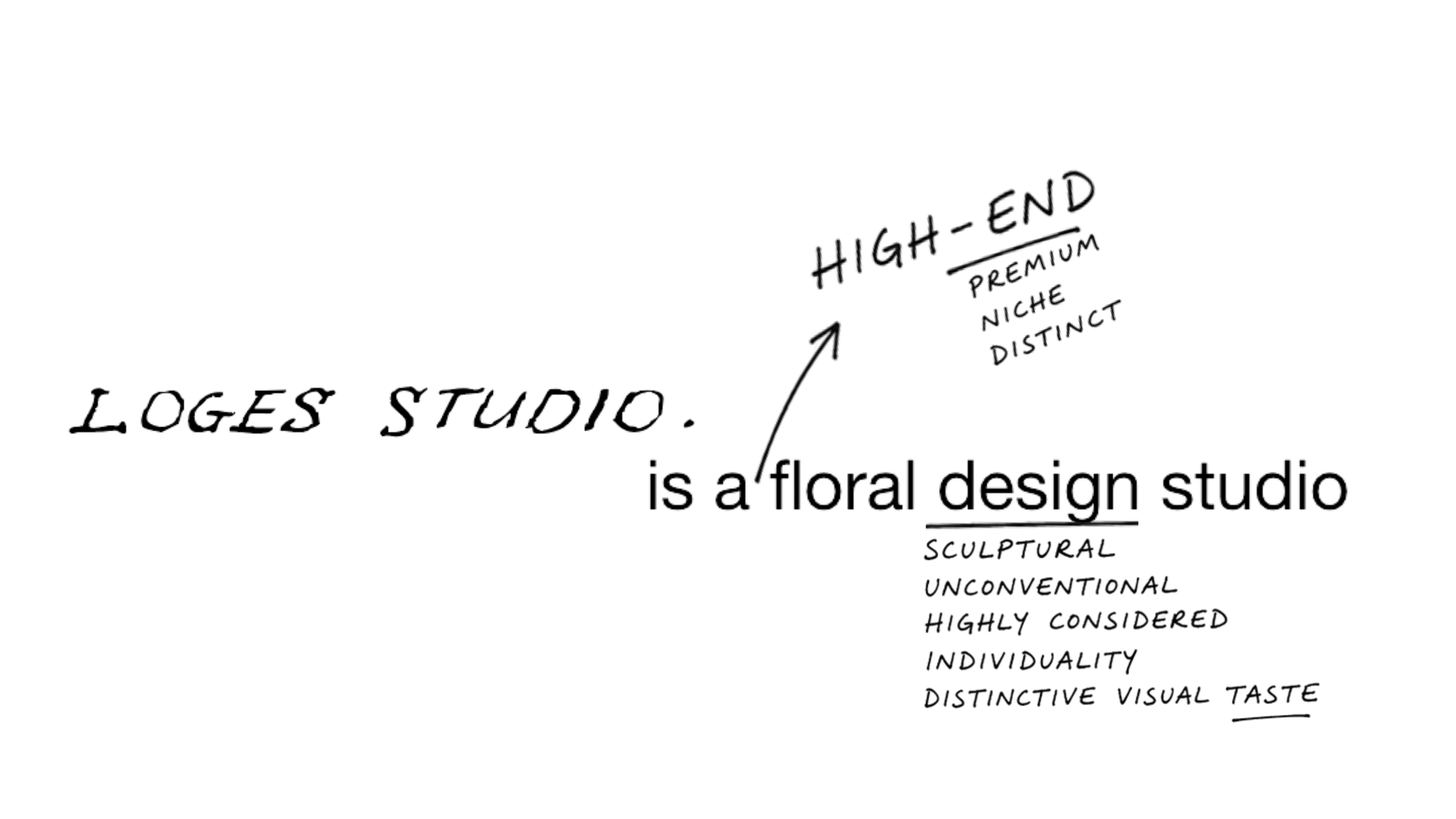
Position the studio beyond conventional floristry
Build a system from one client-supplied handwritten wordmark
Carry the identity across physical + digital applications
THE APPROACH
Let the identity vary the way the florals do, never identically
repeated, but recognisably one system.
DISCOVERY
Vintage art catalogues · artist correspondence · typewriter ephemera ·
handwritten notes · botanical imagery · tactile paper
DIRECTION
Space · irregular typography · image-led composition · variation ·
restrained structure
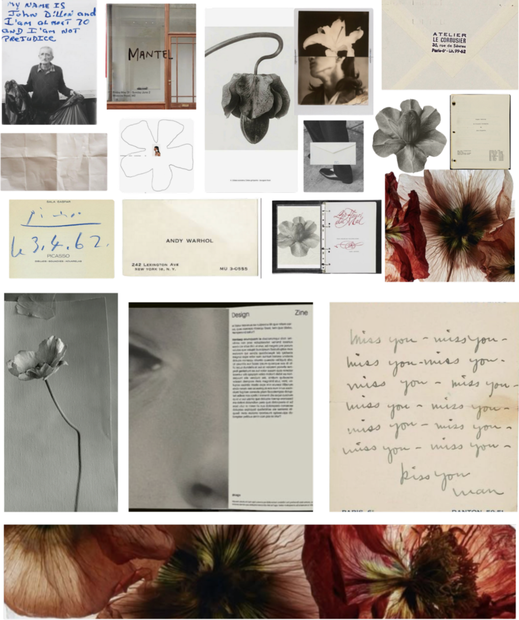
Photos used as reference for visual direction only.
BRAND IDENTITY
01 — LOGO SYSTEM
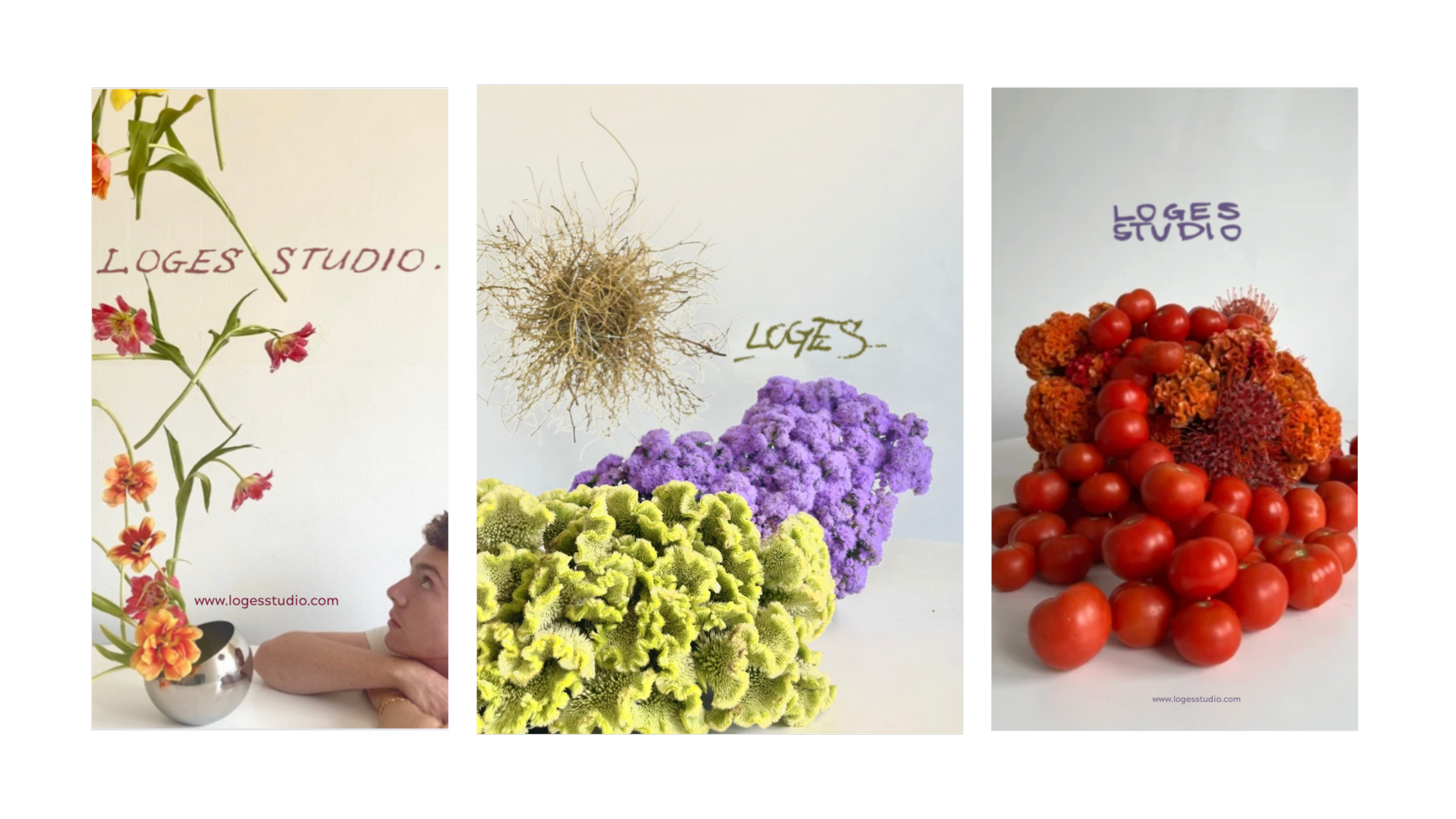
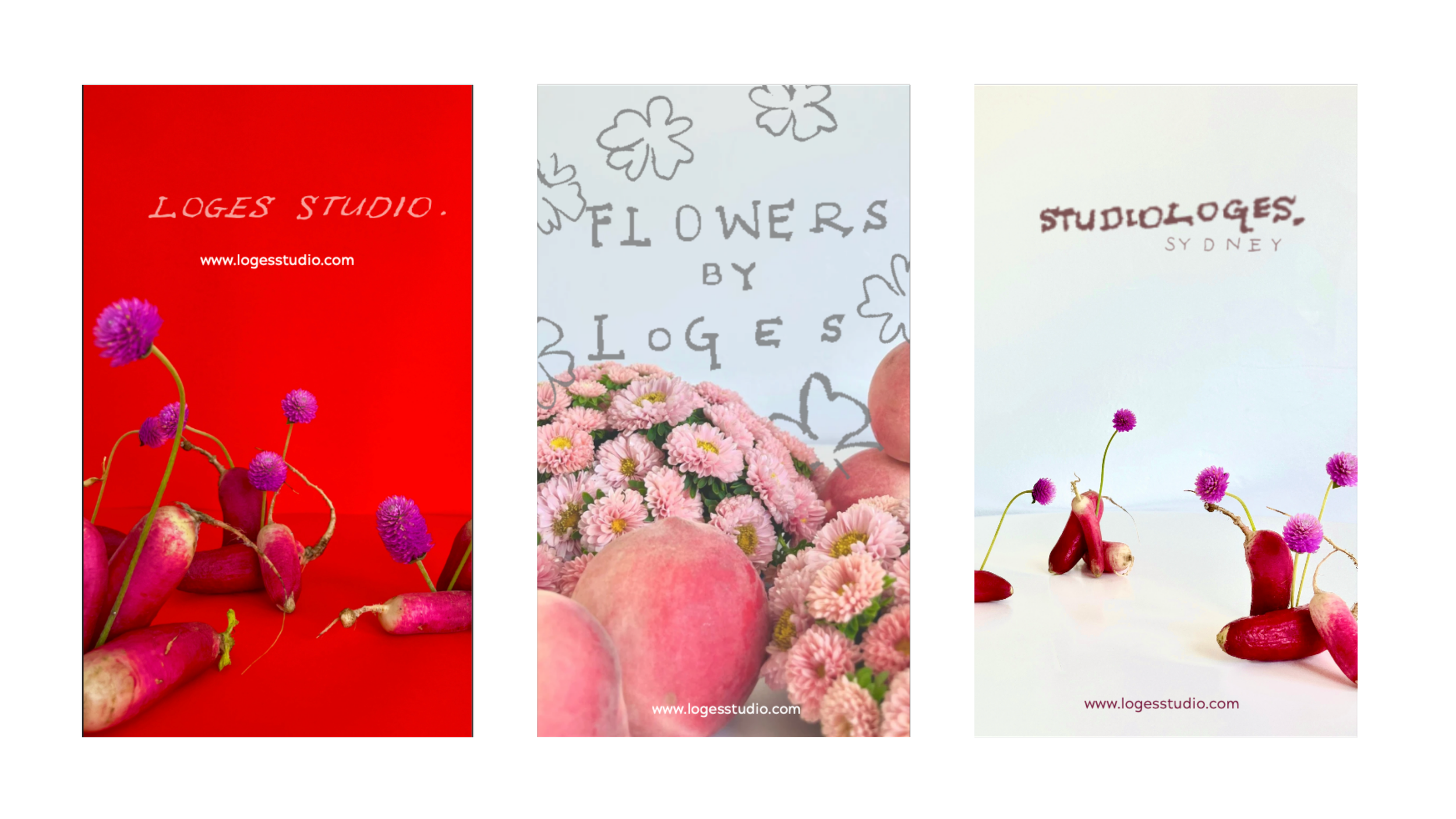
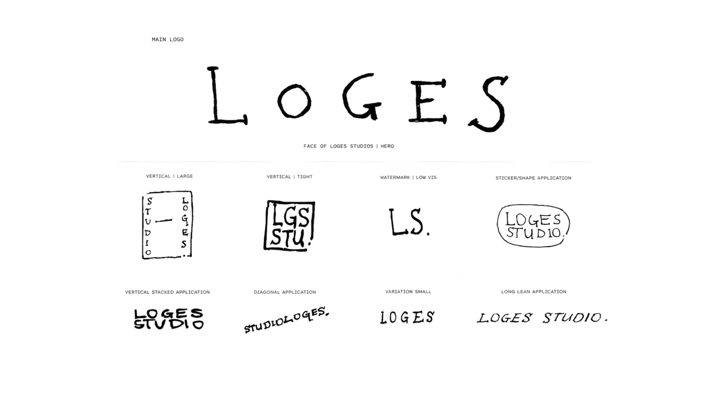
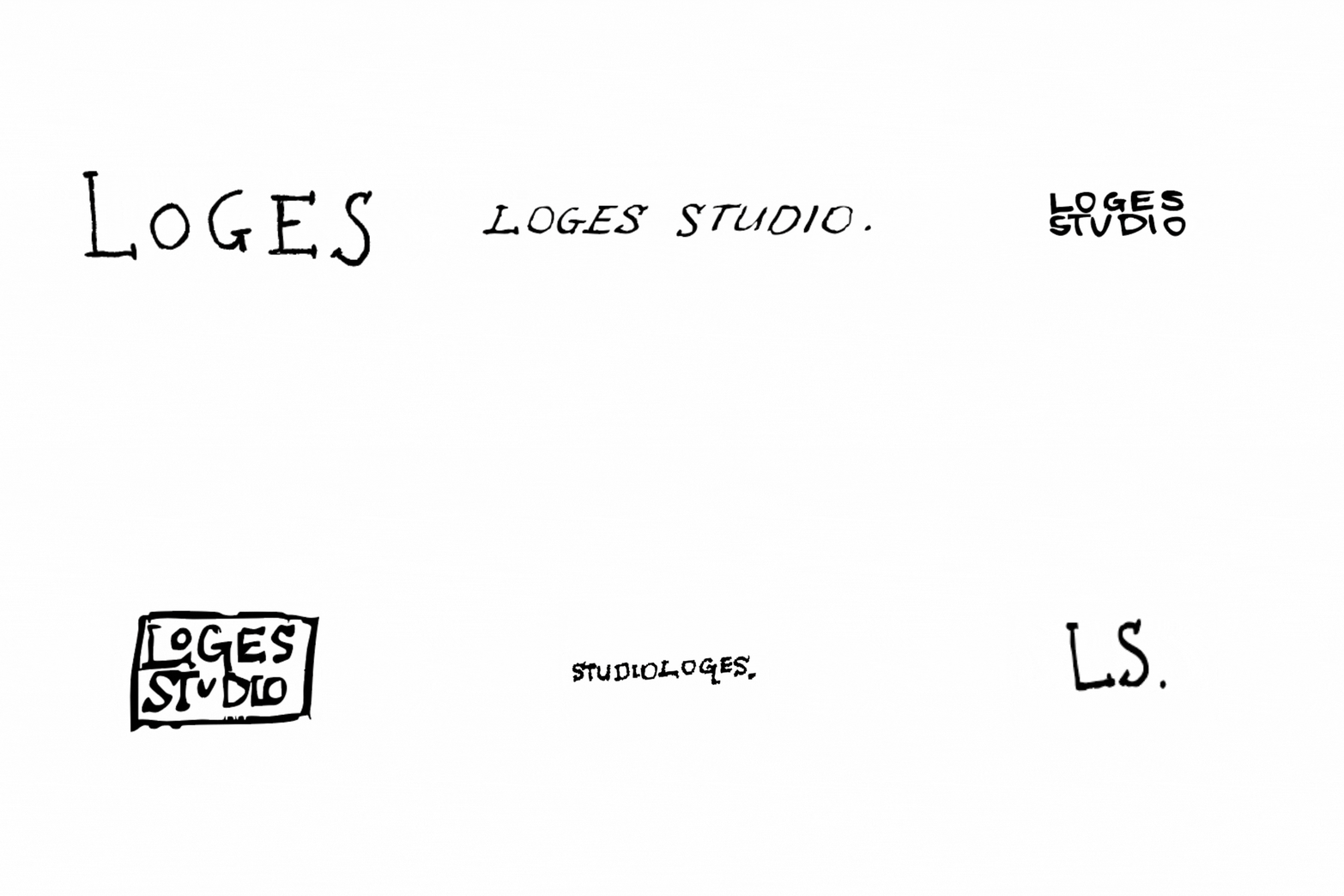
Expand one client-supplied handwritten mark into nine
configurations for different formats without forcing one
fixed lockup everywhere.
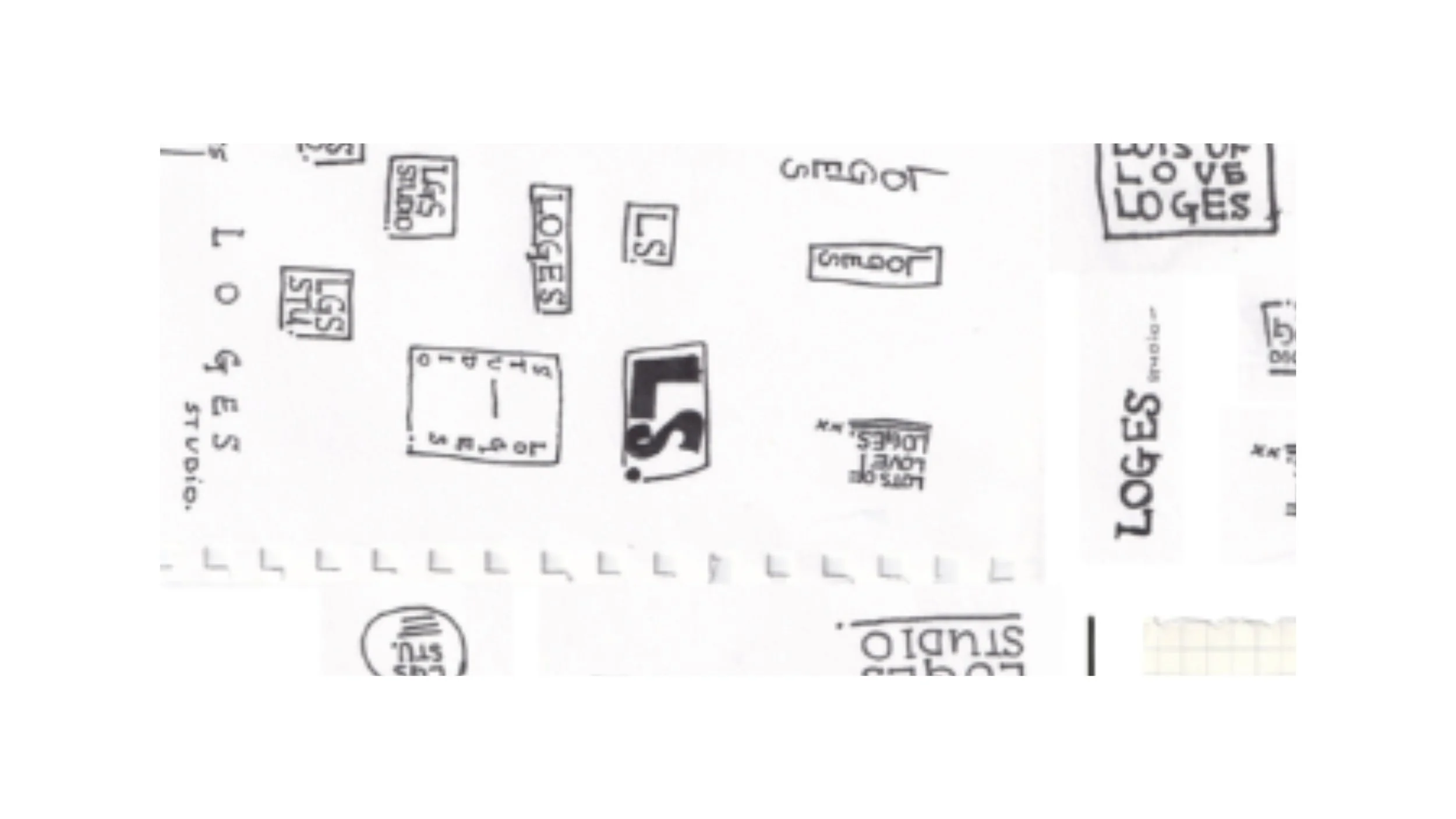
Sketch variations by hand before scanning
Test vertical, diagonal, compact + elongated compositions
Vectorise selected forms in Adobe Illustrator
Retain irregular letterforms instead of geometrically standardising them
Assign different configurations to scale + format
02 — CUSTOM TYPE
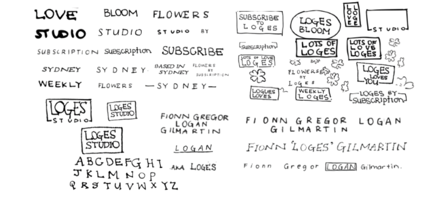
Extend the handwritten logo language into a working display alphabet,
then pair it with functional supporting type.
Restrained type brings structure when juxtaposed with the expressive hand-drawn lettering.
Akzidenz Grotesk Bold
Structured hierarchy
IBM Plex Mono
Small informational text
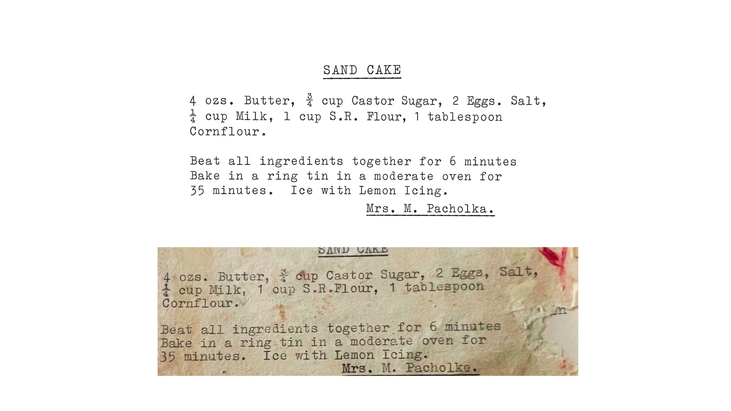
STRUCTURED TYPE
The old family recipe became a reference for intimacy and order, with its
typewritten format informing the contrast between something structured and
something personal, saved and lived-in.

03 — COLOUR + IMAGE
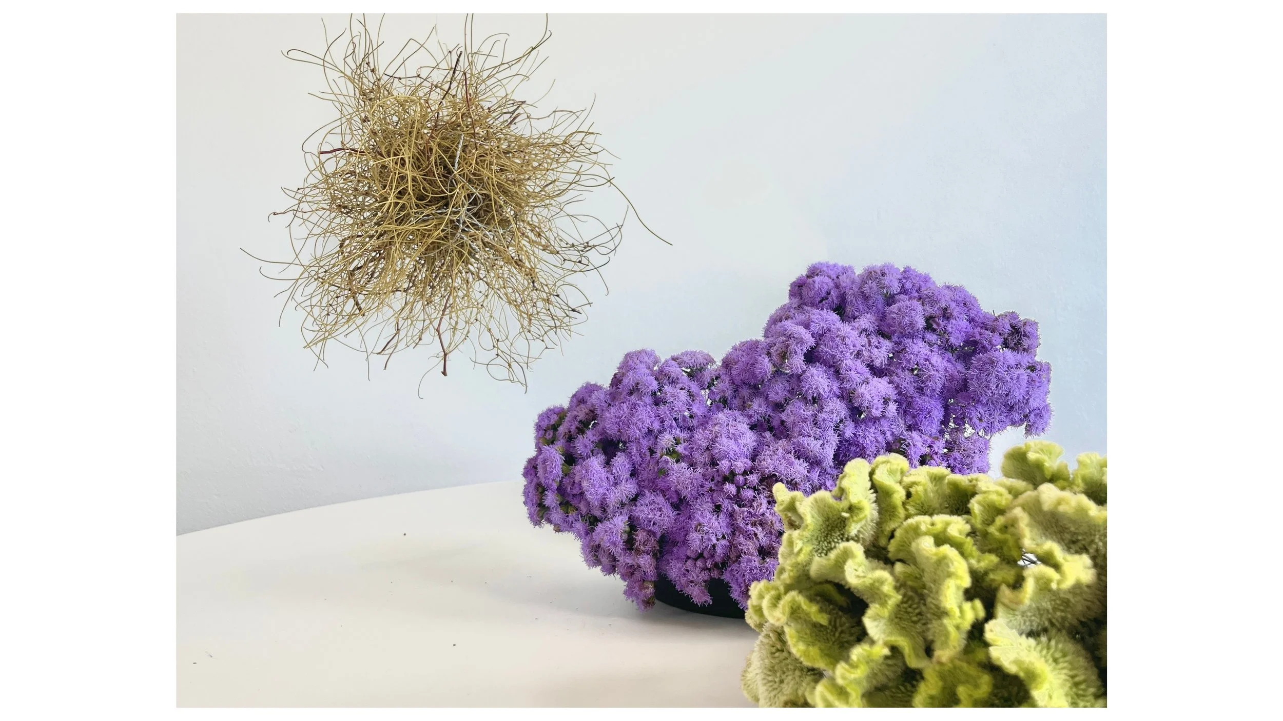
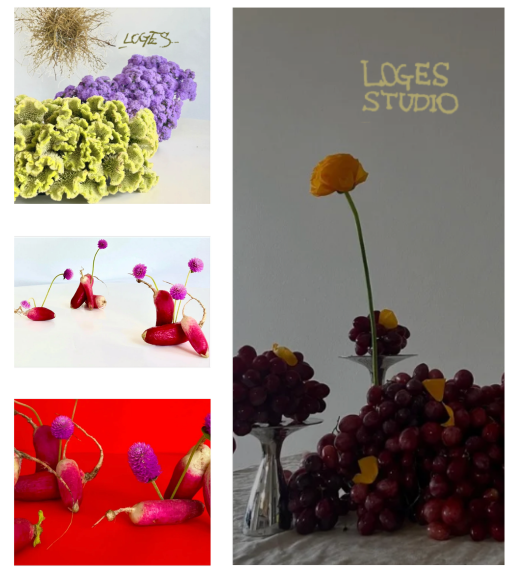
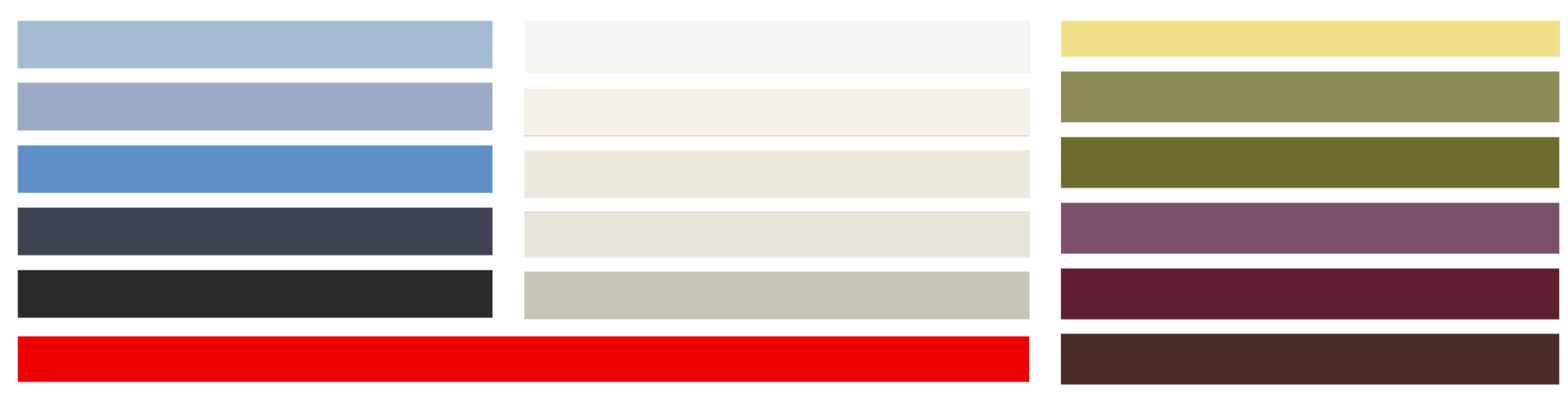
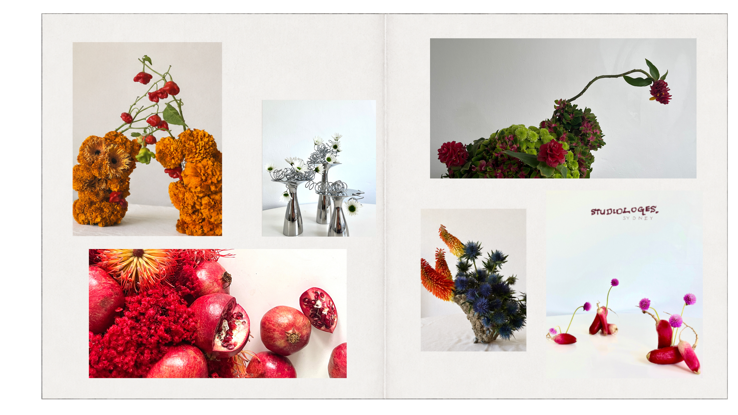
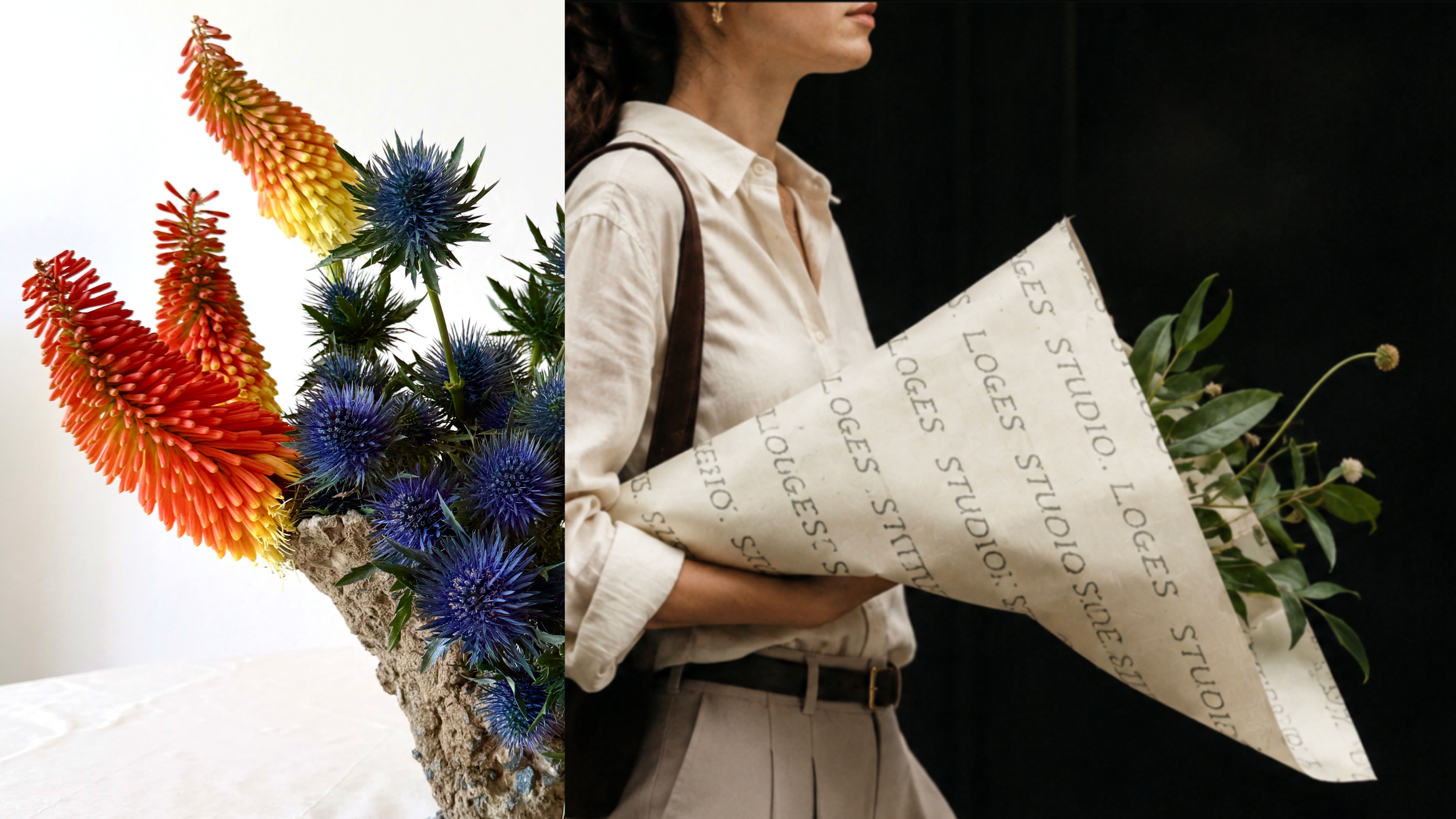
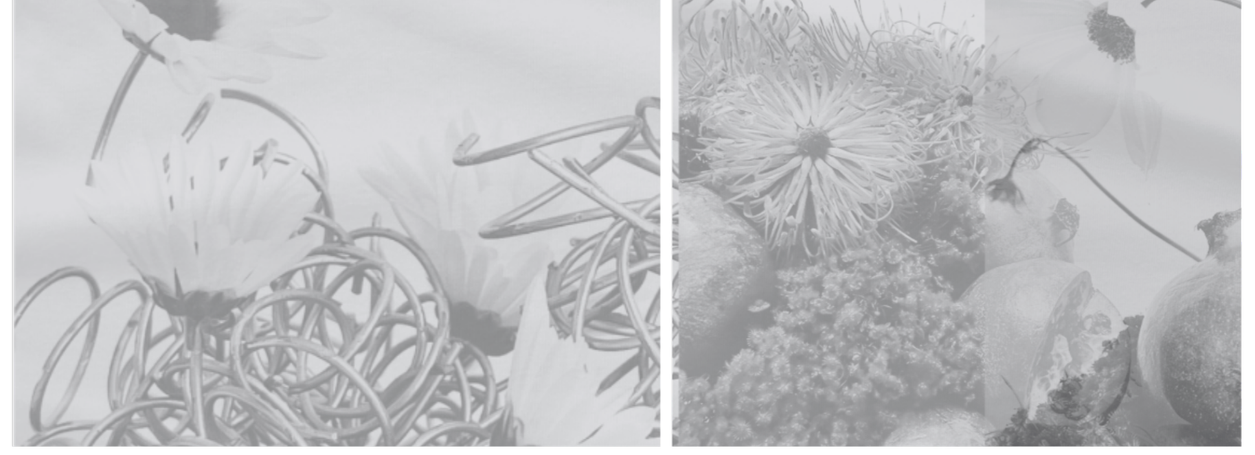
As the florals change with the seasons, the Loges palette shifts
with them, using seasonal colour to complement the work rather
than compete with it.
Build the base from cream, blue + olive
Introduce red, burgundy + yellow as higher-intensity accents
Use neutral studio backgrounds where floral colour carries the composition
Use saturated fields where colour becomes part of the image treatment
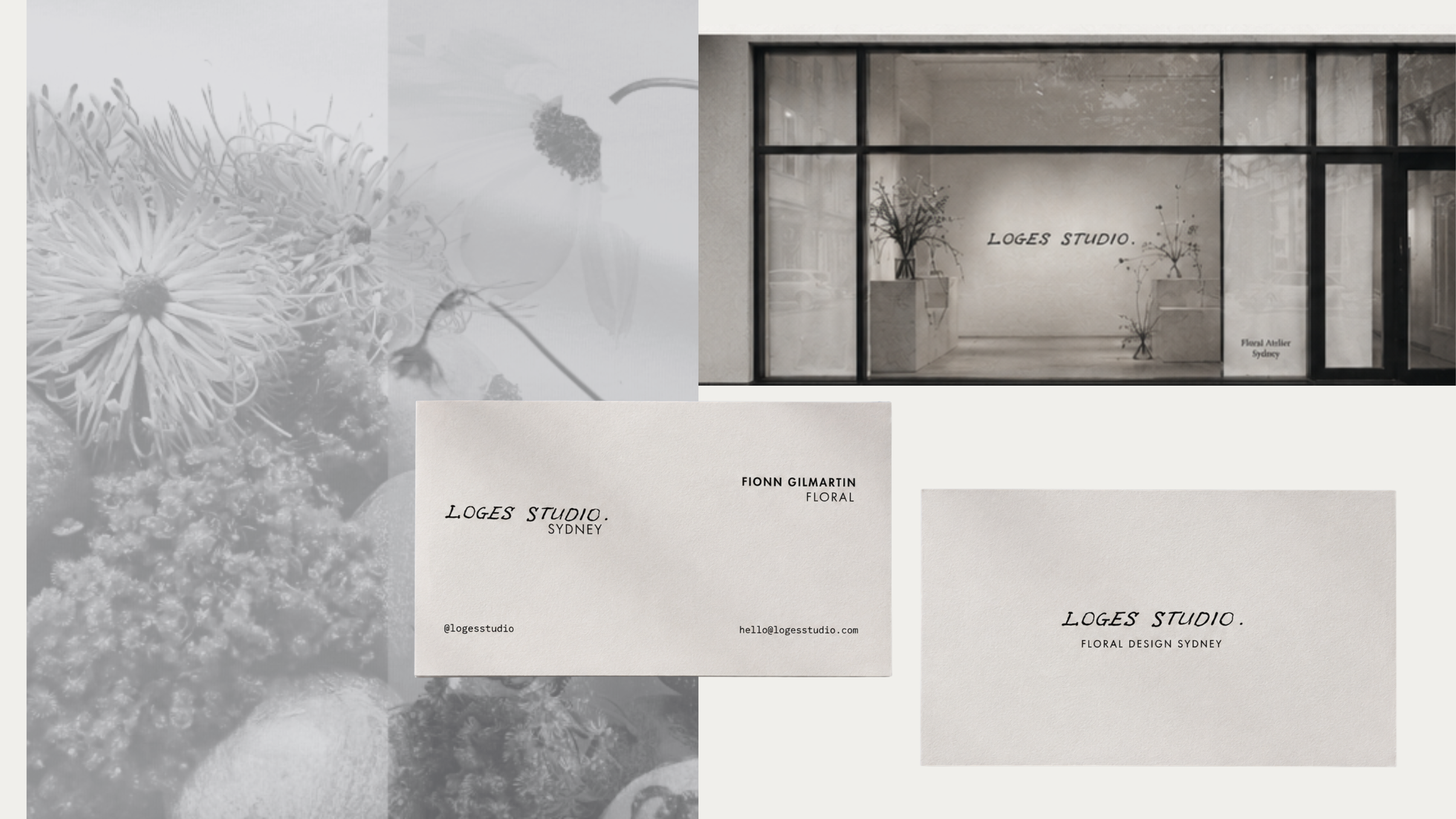
Overlay logo configurations at changing scales + orientations
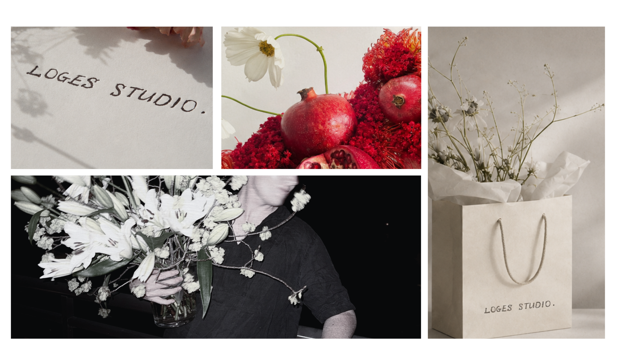
04 — PHYSICAL APPLICATIONS
DIGITAL EXPERIENCE
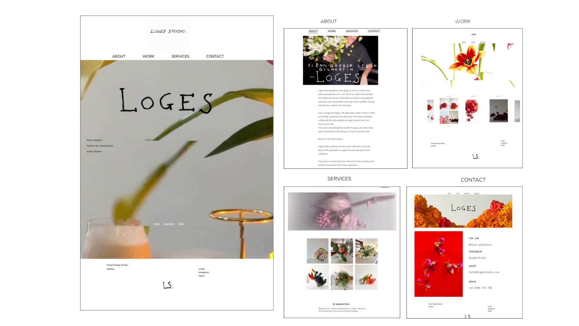
05 — INFORMATION ARCHITECTURE
Structure five core pages around three user tasks:
view the work, understand the services, contact the studio.
Pages — Land · About · Services · Work · Contact
Keep About · Work · Services · Contact in primary navigation
Lead the landing page with floral imagery + the Loges identity
Route service enquiries through the Services page
Provide direct social, email + phone pathways on Contact
06 — CONTENT HIERARCHY
Image-led Work page
Project detail held in 73-page portfolio
Titles · categories · dates · descriptions
Repeatable editable project templates
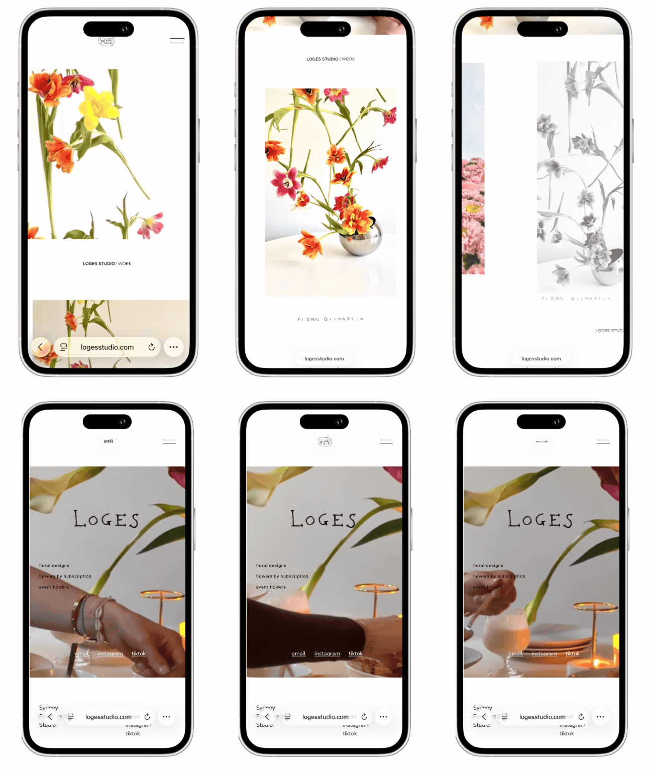
07 — RESPONSIVE DESIGN
Responsive imagery
Stacked mobile layouts
Adjusted type scale + spacing
Core navigation remains accessible
08 — CUSTOM UI
Custom-coded contact buttons
Back-to-top interaction
Linked footer watermark
Consistent link + interaction behaviour
09 — MOTION
Movement is introduced at entry through the changing Loges mark,
then carried through the site with floral video.
Eight hand-drawn logo variations cycle through the top landing sequence
Floral video introduces movement across key pages
Restrained navigation sits against more expressive moving imagery
OUTCOME
Loges now reads as a design-led floral atelier, with a flexible
identity that can shift across print, digital and motion without
losing its character.
IDENTITY
1 handwritten starting mark → 9 logo configurations + 1 custom display typeface
DIGITAL
5-page Squarespace site · responsive layouts · custom interactions · motion
SYSTEM
New floral imagery, projects + applications can enter the existing structure
without rebuilding the identity.